
Hi, it’s Lisa Cheng Smith, founder of Yun Hai. I write Taiwan Stories, a free newsletter about Taiwanese food and culture. If you aren’t yet a subscriber, sign up here.
This is Studio Notes, a paid series within that newsletter. It’s an informal exploration of the things on my desk—cultural references, first-hand research, and archival material—all in relation to how we tell stories, create spaces, and design products at Yun Hai.
Your paid subscription supports the free newsletter and our cooking show, Cooking With Steam. If you’re a paying subscriber, thank you so much! If you'd like to read behind the paywall but aren't able to subscribe, I also trade words for words—just reply to this email.
Late last year, I read Ina Garten’s memoir about her specialty food shop and subsequent cooking empire. Celeb brush-ups, Hamptons energy, and Jeffrey obsession aside, her story was very inspirational to me. In 1978, she impulsively bought Barefoot Contessa, a specialty foods store in Westhampton Beach, took it over with no experience, and built a retail, cookbook, and television cooking kingdom that defined boomer food as we know it today. No shade, by the way, I love boomer food. Lee Bailey is my idol. I make my steaks the way Ina taught me. I prefer brass-castered upholstered chairs to the Eames shell, at least for dining.

I’m a business owner with a small grocery, cooking show, and aspirational food newsletter, so most of what she shared was both familiar (every week she took one day to drive a van several hours to NYC, pick up from all her vendors, then head back) and validating (she consistently emphasizes that the only reason Barefoot Contessa succeeded is because she listened to her gut, even when it conflicted with the advice of the sensible).
Where her shop and business were concerned, no problem was too small to deserve her full attention. Every friction point, difficulty, or mismatch was worthy. From the book:
You bake cookies, you sell cookies, and if the cookies don’t sell, you make something else that customers will love and that WILL sell. It’s a business problem to solve, and it involved chocolate chip cookies.
(P.S. She’s also known for saying that “most of life’s problems can be solved with a good cookie.” In this case, the problem is the cookie. But I guess the solution is still a good cookie, so yeah, holds up. Wise.)
I took this idea to heart, partially because it validates my constant, pining desire to fawn over every aspect of Yun Hai’s presentation and process. Nothing is too small for my undivided attention.
I would say the same thing to my staff: everything is worth fixing to the best of our creative abilities. Move through things thoroughly, and good things will follow. Time and project management is essential (and very difficult), but remember that small wins with integrity bloom into big ones.
One of the biggest challenges we face day-to-day is how best to convey the big story each product has behind it: the humanity, craft, and technique in the production, and how to use it in day-to-day cooking or traditional recipes.
I’m a walking encyclopedia of Yun Hai product (hence the TLDR nature of these emails, thank you for reading), but getting that knowledge out in digestible pieces to our customers is both paramount and difficult, especially in our retail store, where space is limited. We could spend days with customers sharing all that we’ve learned, but that’s hardly effective on a larger scale, especially if we want to open a second, larger store one day (I do) or pop-up in another city.
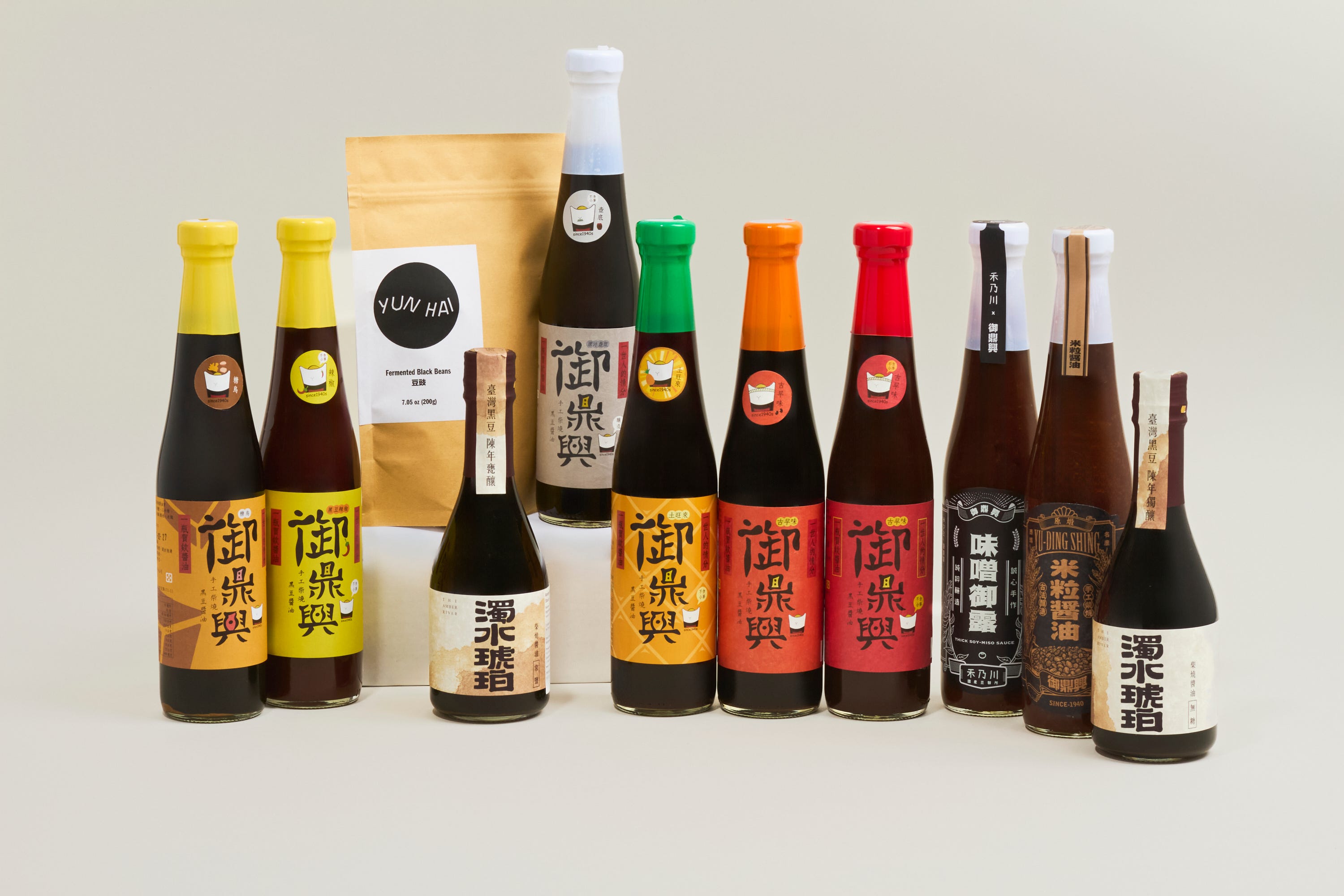
Today, in Studio Notes, I’m sharing a small problem that has been on my list for years: conveying the differences between our various Taiwanese black bean soy sauces to customers in our Brooklyn gamadiam (general store).
The solve is simple: we need better signage. Today, I’m taking the Garten approach: take it seriously, solve it creatively, no matter how small.
Soy Sauce Signage
Over the years, our Yu Ding Xing soy sauce collection, a foundational and top selling line, has grown to more than ten different types. The most common question we’re asked is how to choose between them. The answer has to do with their brininess, mouthfeel, tasting notes, ingredients, and intended use. On our website, we have plenty of real estate to wax long about Taiwanese soy sauce, what makes it special, and offer usage suggestions. In the newsletter, we can go on even longer. Case in point:
黑豆油: Everything I Know About Taiwanese Soy Sauce, Part One

This is Yun Hai Taiwan Stories, a newsletter about Taiwanese food and culture by Lisa Cheng Smith 鄭衍莉, founder of Yun Hai. If you aren’t yet a subscriber, sign up here.
In the store, there’s very little room for printed information, and customers don’t have time for a long-winded introduction. To complicate matters, we’ve elected to keep the packaging as is, which is Mandarin-forward, so the translated English name of the product isn’t even printed on the front of the product. This works for preserving the authenticity of the brand, but it can be intimidating to the black bean soy sauce newcomer.
For years, I’ve been talking about making nice signs to help differentiate these in-store. Next month, we’re releasing a soy sauce recipe zine and doing a tasting in the shop (Sep 20, save the date). So, I decided to give myself a chunk of time to finally sit down and give it a go.
I spent a couple hours, starting with some of my kids’ cardstock and moving to a natural art paper. I have a design background and pull most of my shelf-talk gestalt from my experience making maquettes (models) of artworks for the Guggenheim as a junior designer (first job). It’s relaxed, but it works I think.
For the soy sauce, we have limited space on the shelf, so I thought it would be nice to make signage that could stay with the bottle, and hang on the neck. My goal is to create a little extra real estate to convey tasting notes and product features, without overwhelming or impeding the display.
Here’s my design process:
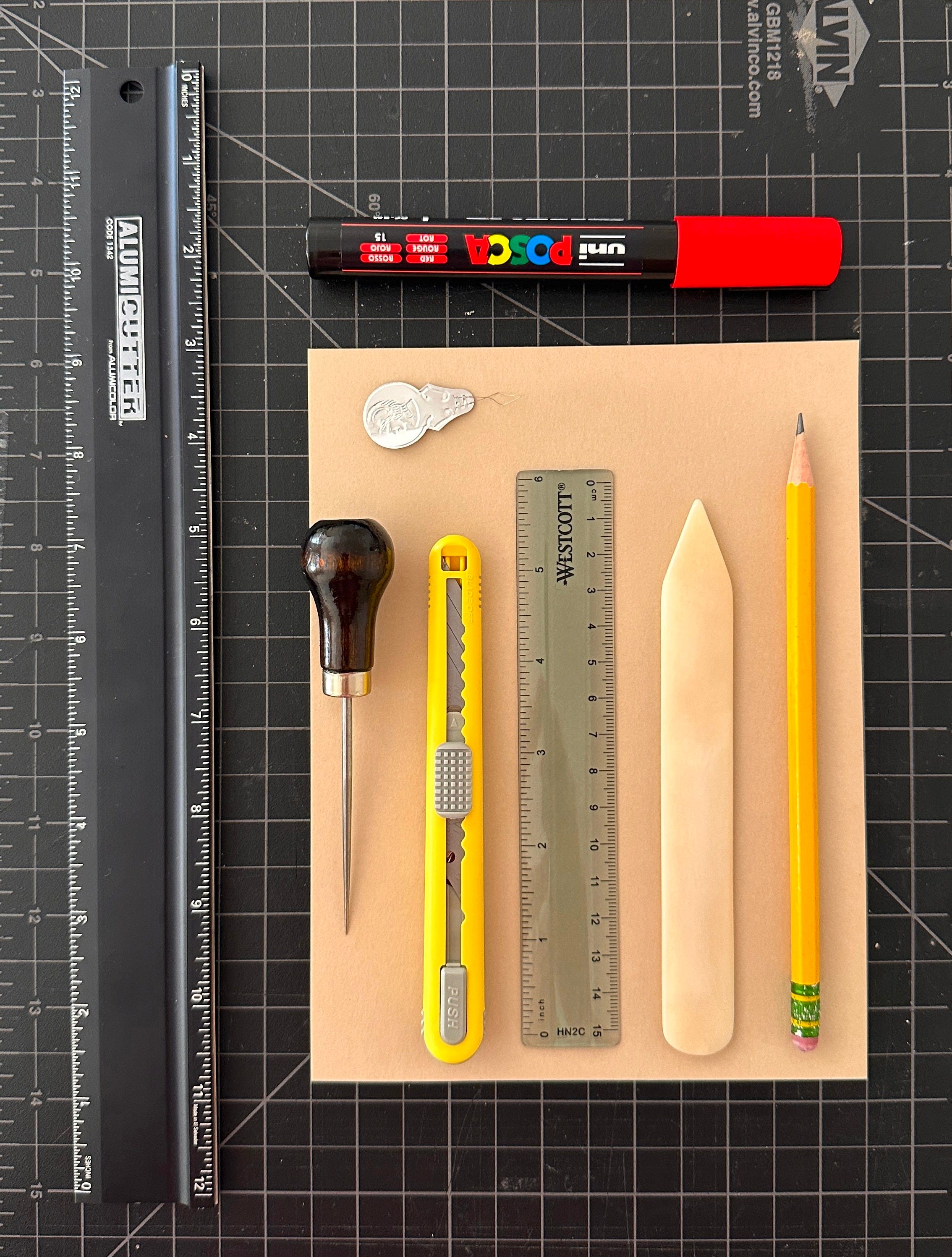
TOOLS
You can certainly make signs with less than this, but here’s my junior designer toolkit: a cutting mat, a straightedge with a cutting surface (not just a flat ruler), a fine utility knife with snap off blades (I favor NT Cutter), a small transparent ruler with metric and inches, a bone folder, a pencil, a beautiful fat Posca marker for lettering, and finally, because I sometimes work with string, an awl for poking holes, and a needle threader for bringing string through them.
ITERATION
I always start with things I have on hand. I prefer scraps and cast-offs to blank pieces of white paper, because they already have an aesthetic and a memory. I also know that whatever I make first will be wildly different from the end result, so I really don’t sweat it all that much.
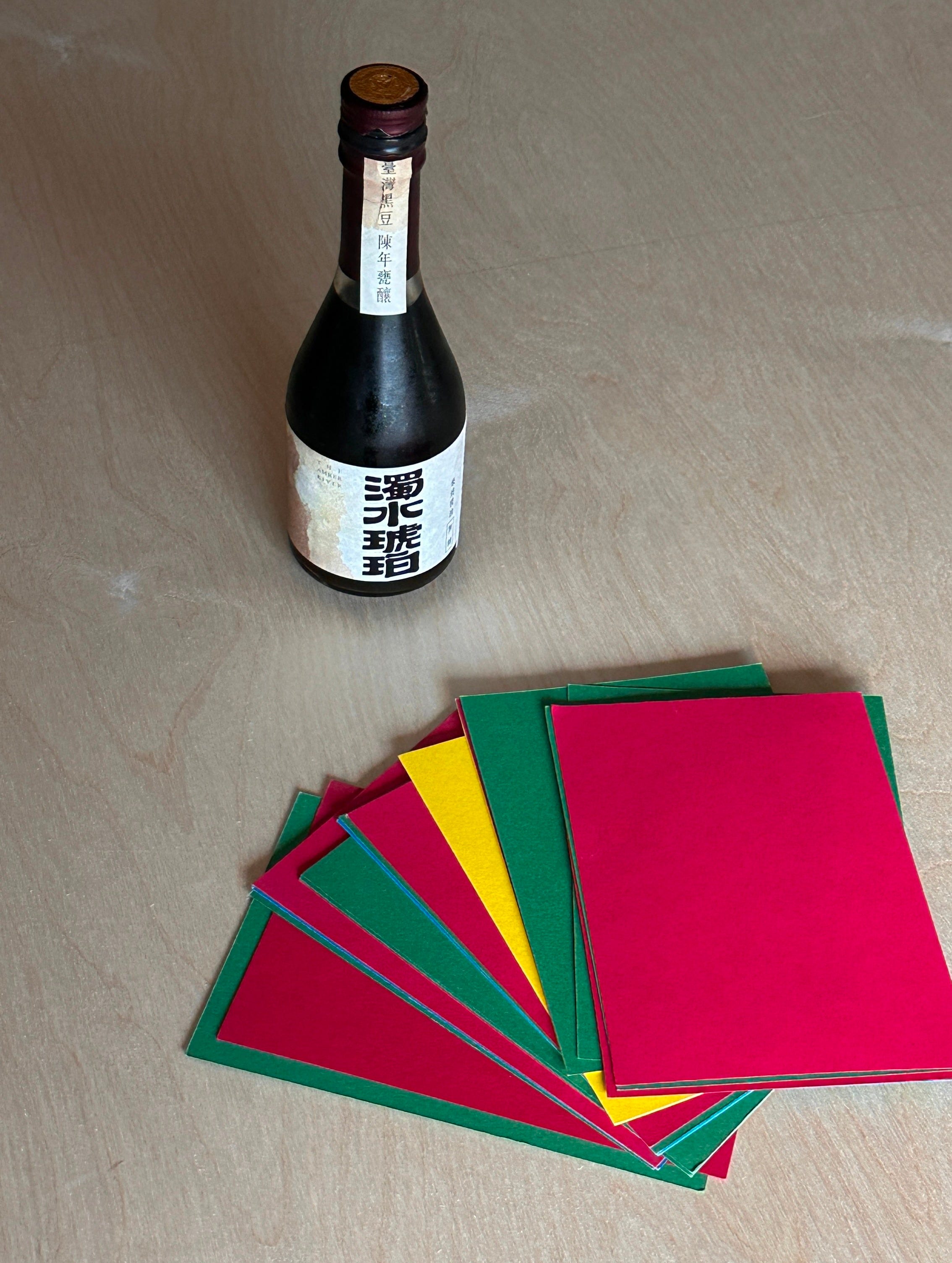
Today, I knew I needed some heavier card, so I used scraps of colored card stock I had picked up from a free pile outside my studio for my kids.
I knew I wanted the sign to hang off the neck, so I made the first thing I thought of, modeled off hotel room Do Not Disturb doorknob hangers.
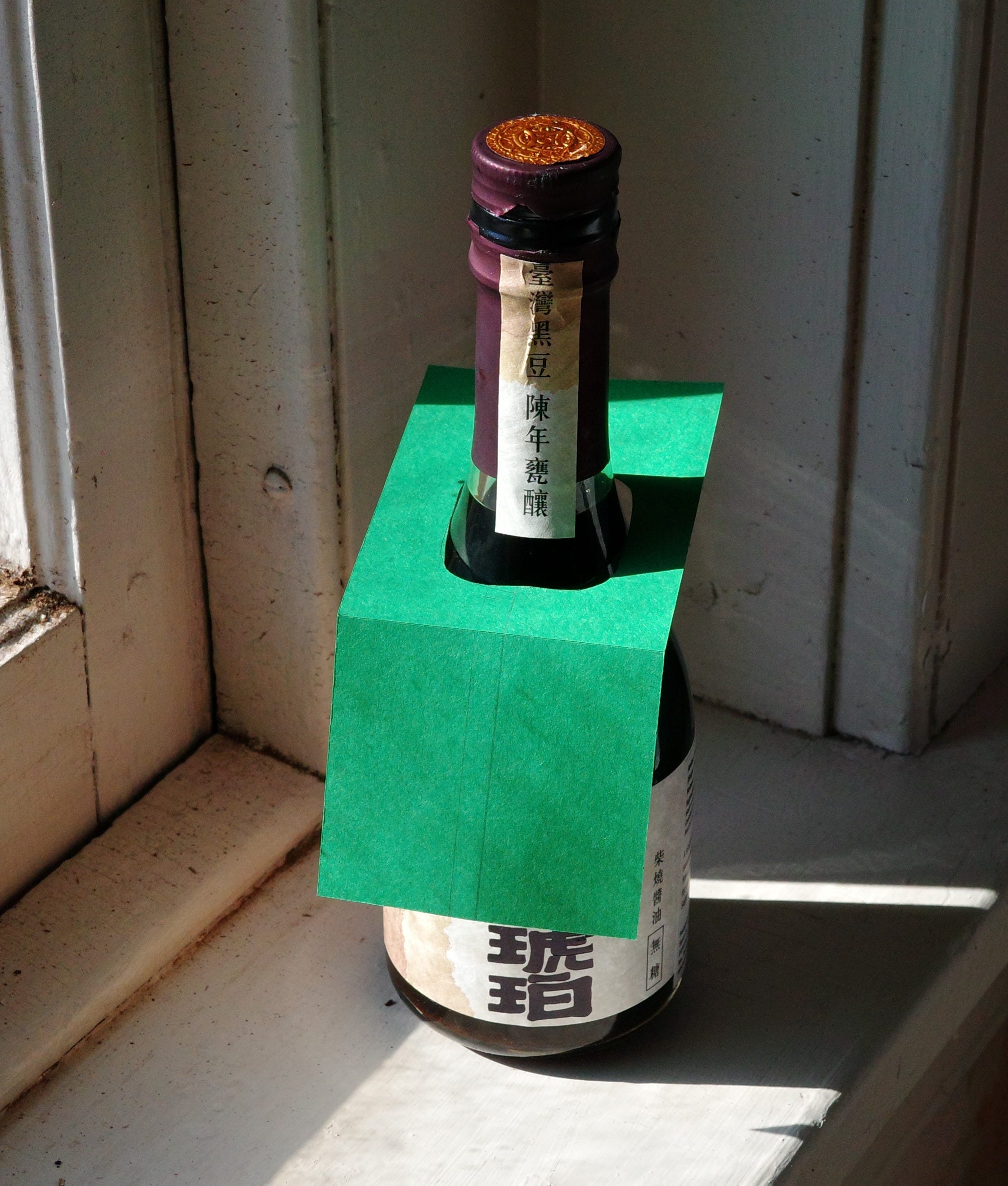
This worked structurally, but obscured the bottle way too much, with both color and shape, so I found a piece of natural colored heavyweight art paper, and freehanded an alternate solution.